This article was published in the San Antonio Express News on September 22, 2021 about a project that our team completed in Helotes. It was featured on the Lifestyle section, and written by Richard A. Marini. All credit for content is attributed the original publication. To see the original article in its entirety, please visit this link.
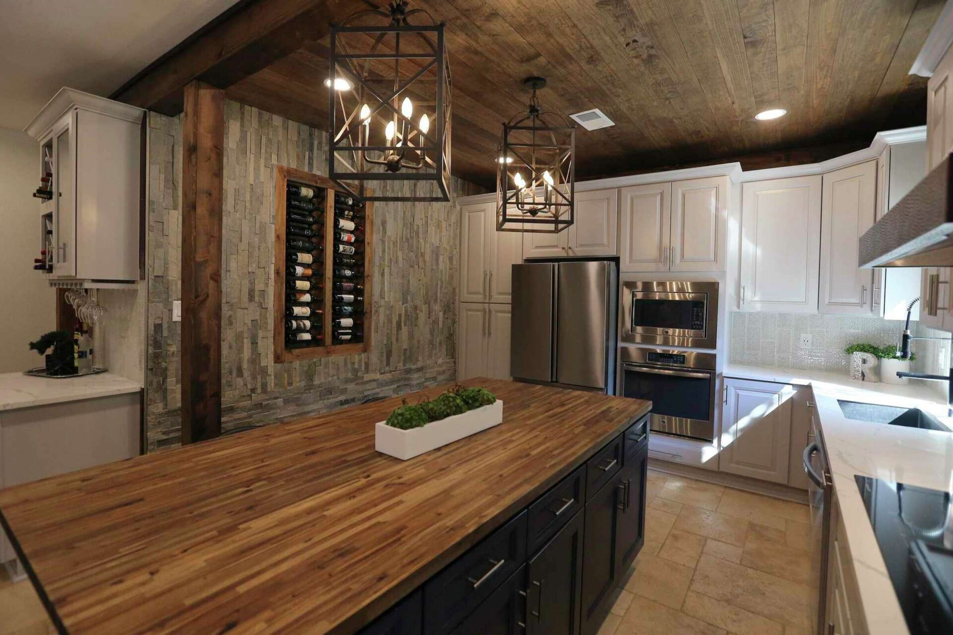
When Eddie and Chantal Rascon decided to update the tired kitchen in their newly purchased mid-’90s Helotes home, they rejected the idea of a monochromatic kitchen, opting instead to boldly mix things up to create a fascinating space their designer calls “Old World but modern.”
“This is my favorite style because you get to mix the different looks,” said Monica Beyer from New Generation Kitchen and Bath. “Here there are all these different textures and colors, but they work together in the end.”
The couple looked at 68 homes while house-hunting in 2020, but the market was so hot, the homes they went to see often were already spoken for before they’d even arrived. By the time they got to their current home, there were already 13 offers on it.
“I was taken aback when we looked inside because it was a real fixer-upper,” said Eddie, an investment analyst who said they still had to offer 40 percent above asking to get it.
Though the four-bedroom, 2 ½-bathroom house would require a lot of work throughout, their first priority was the kitchen. The renovation, which began shortly after they moved into the house in October 2020, took roughly 3 ½ months and cost approximately $68,000, with about $20,000 of that going toward new cabinets. The price would have been higher, but Eddie did some of the work himself, which he learned from his father who was in construction.
The kitchen was small and cramped, with a partial wall on one side of the kitchen that hid much of the room as one approached the space and a peninsula on the other side that stymied the traffic flow. To update the look and feel of the room, they removed the partial wall and replaced the peninsula with an island.
“That really opened things up,” Beyer said.
But the wall was load-bearing and removing it revealed a support post they considered — and rejected — taking out.
“Installing a stronger support beam across the ceiling would have cost thousands of dollars,” Eddie said. Instead, they wrapped the post in wood so it would blend in with the other wood features in the room, such as the maple butcher block topping the island where their three young children often eat their meals.
Beyer said she liked several of the kitchen details that were already in the home, including the light, walnut-tone travertine floor tiles and especially the brick-faced, double-sided wood-burning fireplace in the wall between the kitchen and living room.
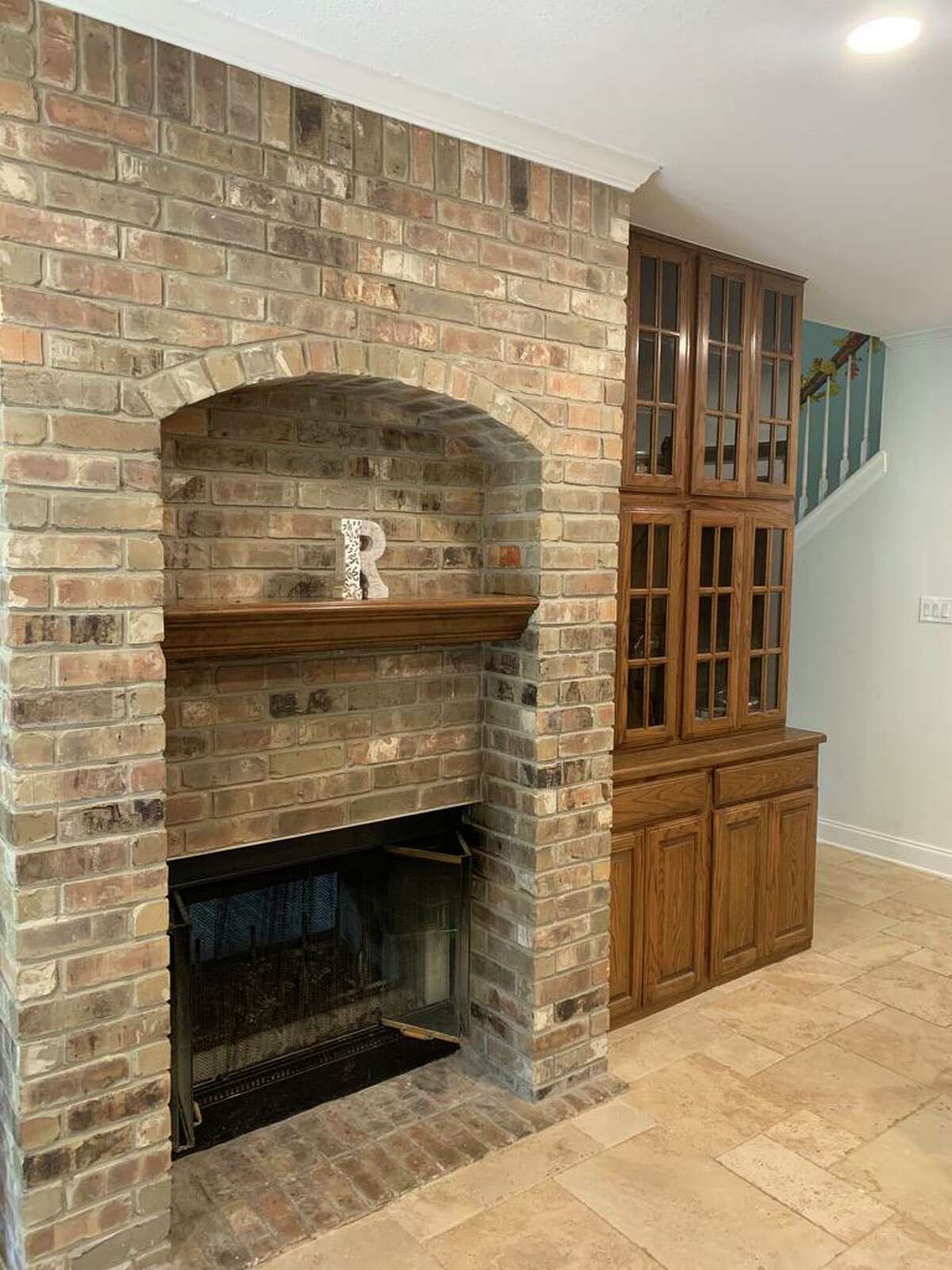
“You don’t see that a lot in American homes,” she said of the fireplace. “It gives the space a luxurious, European feel.”
The kitchen now is a room of contrasts and one of the most striking are the colors they selected for the cabinets: light gray for those along the wall and a darker blue for the island.
“Monica put the colors together and it’s like an ensemble of things that really flow,” Eddie said. “And she helped us see that because she had a lot of examples in her portfolio that she was able to show us.”
Another feature that really pops is the backsplash, which consists intricately patterned, custom tiles from Spain in a subtle gray. The high-sheen tiles start behind the sink but then continues until it fills the entire wall, including around the door leading to the backyard.
“We wanted something unique, and it’s not too often you see a backsplash extend beyond the area under cabinets,” explained Chantal, a financial planning consultant. “Additionally, having so much tile allows everyone to appreciate the custom designs.”
While such tiles would typically be laid out horizontally and randomly, the couple decided instead to arrange them vertically. And because the tiles were made in a half-dozen different patterns, they used the same pattern for each column — at least that was the plan.
“Actually, the pattern breaks toward the end because we ran out of some of the tiles and had to make do,” Eddie said.
The Old World look Beyer likes so much can be seen in the hand-hammered copper finish vent hood above the range. From Zline, it looks like it would fit comfortably in a French country kitchen.
“That was one of the items we had to wait for because of the pandemic,” Eddie said. “It took us 2 ½ months to get it.”
They also changed the style of the cabinets at the last minute, switching from a shaker style to raised panel, to retain the look. “I think the raised panel is more luxurious,” Beyer said. “So it works better in this space than a simple shaker-style would have.”
Another intentional contrast can be seen between the sink side of the kitchen, where the countertop is smooth, white quartz with handsome gray veining and the opposite wall, made with roughly stacked thin strips of stone in grays and browns.
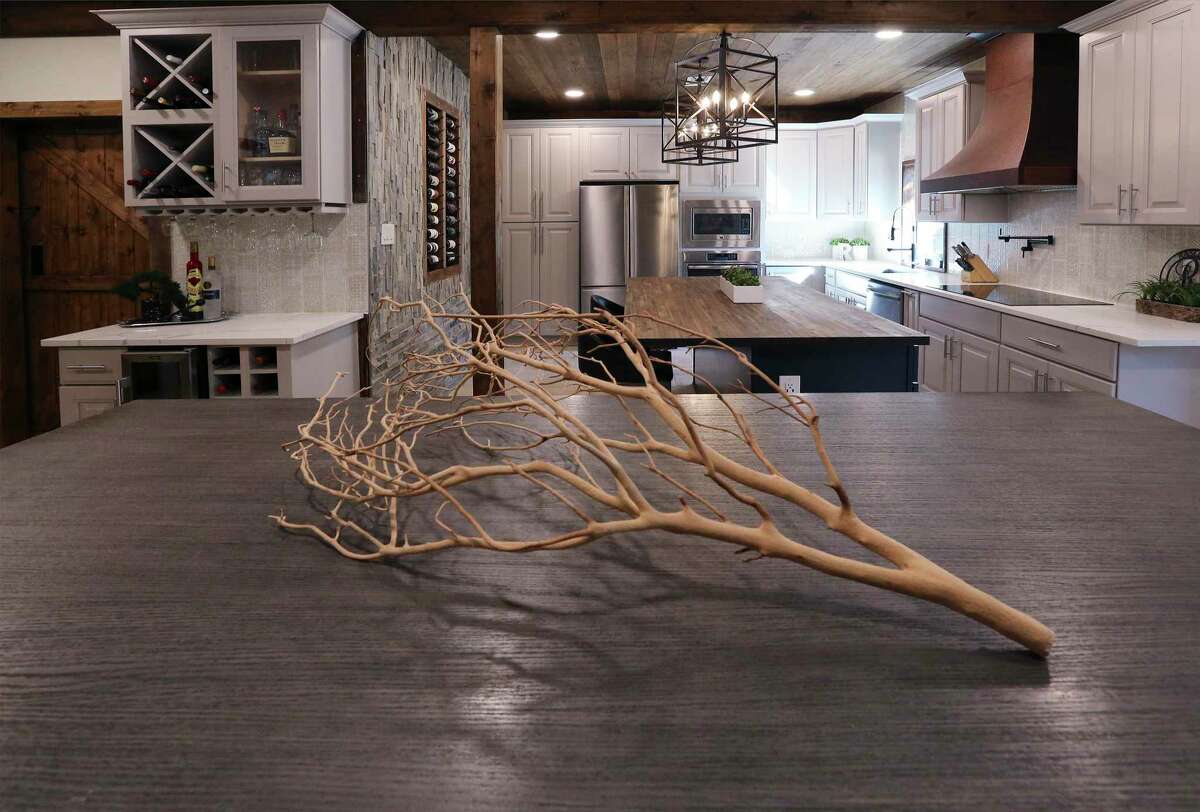
“My wife got to do her side and I got to do this side,” Eddie said. “I told Monica I wanted it to feel like I’m in two different rooms at the same time.”
The stone strips are stacked vertically from the ceiling to about 3 feet above the floor, and horizontally below that. Eddie, who designed and installed the wall, explained that he intended the horizontal section to follow the same line as the butcher block island top and for the vertical bricks to draw the eye upward, toward the ceiling, to make the room seem bigger.
At the center of the wall, an inset holds two-dozen dozen wine bottles. “I enjoy drinking wine, and I wanted somewhere to store and display some of my collection,” Eddie said. “I had to convince Chantal to let me do it because she was, like, ‘That’s too much wine.’ ”
Yet another eye-catching feature is the ceiling, made from wooden slats stained to look like they’re in an old French farmhouse.
Because of COVID-19-related difficulties during construction, they were told they’d have to wait months to have the drywall ceiling installed. So, deciding to continue the wood look they were using elsewhere, including the doors to the nearby powder room and pantry, they asked the painters who were already on site to stain and install the boards.
“And as an additional benefit, the pipes that run to the sink and things like that run above that ceiling,” he said. “If we need to fix something, we just need to take down a couple of planks instead of cutting through drywall.”
When they’re not eating at the island, the family sits at the counter height dining table adjacent to the kitchen. “We’ve kind of gone away from a formal dining room,” Eddie said. “We had one in our former house, but we’d only use it for Thanksgiving.”
Now that it’s finished, the kitchen often serves as the center of gatherings for holidays, birthdays and family gatherings.
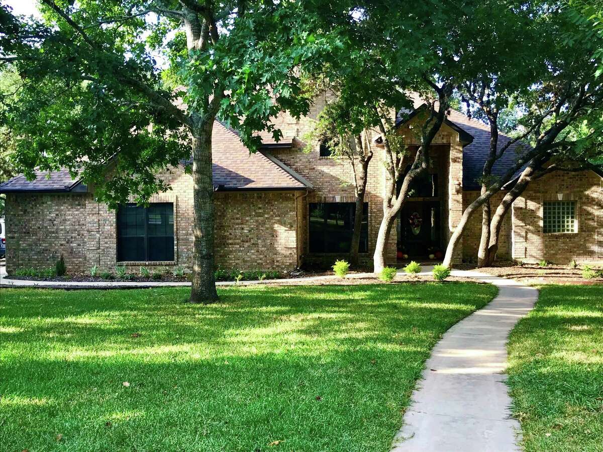
“We cook a lot, which is one reason it was important to have a kitchen that is not only functional, but is also of the times,” Eddie said. “We’ll have as many as 18 or 19 people in here and, with the pool out back, we’re very popular with family and friends.”
Next on their project list is the master bath and they’ll using Beyer as their designer. Because they like to mix things up — but not too much.

